Thursday, 29 August 2013
Presentation boards
 |
 |
A combination of graphical types such as 3d and 2d models as well as plans intregue the audience and captures attention     |
Thursday, 22 August 2013
Public and Private areas and circulation zones depicted
Santiago Calatrava: Milwaukee Art Museum USA 1994
 |
| image 6: Second half of image 5 showing the more private areas of the facility. |
 |
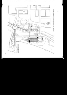
| Image 7: Site plan |
 |
| image 8: Conceptual drawings and model showing part of the realisation process of Calatrava's project. |
 |
| Image 9: Conceptual drawings and model showing part of the realisation process of Calatrava's project. |
Thursday, 15 August 2013
Assignment 1: Experimenting with different shapes
Ultimately I wanted to separate the 'private' and 'public spaces from one another. The bedrooms and bathrooms will be clustered together with a rumpus room and study. The front entrance, living and kitchen a (a laundry will be to the back of the kitchen) spaces, as well as a second bathroom will be towards a separate part of the house.
Thursday, 8 August 2013
Week 2: Tutorial exercise - Paper folding
In todays exercise we developed a set of three models from the inspiration of our chosen architect and their work. Mine was Santiago Calatrava to which I have already exemplified in a previous blog. One of the models showed the abstract nature of our chosen architecture. The second considered the overall portfolio of the architect and worked to achieve a similarity in concept that recurs within most or all of the architects work. The third tended towards a more true representation of the chosen architecture. The first two models required a maximum of 1 A4 page (uncut), whereas the third had an unlimited amount of pages and cutting as required.
Model 3: In combination with model 1, is an abstract representation of Calatrava's work to which I have outlined in a previous blog. I wanted to reflect the overall 'folding' and 'Rippeling' texture of the exterior 'dome' and present my model as a net representation.
Model 2: Worked to represent the overall concept of Calatrava. I wanted to represent the recurring phenomina of Calatrava's architecture 'twisting'. I did this using a fold and twist and pin technique I developed myself through experimentation.
Model1: combined with model 2 was my abstract representation of Calatrava's work, I looked at the use of vectors and line throughout his work and tried to replicate that using a folding and pinning technique I learned on one of the tutorials.
Monday, 5 August 2013
Santiago Calatrava
I chose Santiago Calatrava because his work appeals to me. I find the unusual shapes of his work bold and unique and I love how he pushed the conventions of architecture into new things.. The amount of attention he pays to reflection and form is interesting and the use of line within the landscape of his architecture is fascinating. Light is also another important attribute to his work and he makes sure that the night scene is just as spectacular as the daytime.
I chose Santiago Calatrava because his work appeals to me. I find the unusual shapes of his work bold and unique and I love how he pushed the conventions of architecture into new things.. The amount of attention he pays to reflection and form is interesting and the use of line within the landscape of his architecture is fascinating. Light is also another important attribute to his work and he makes sure that the night scene is just as spectacular as the daytime.
Images Taken: http://www.calatrava.com/
Fridays Tutorial:
The exercise for the day challenged us to piece together information about a particular building site. we were to use the information and draw 3 different 3D drawings explaining the information we were given. Between the three groups, we were given sections, plans and written information. However, the challenge was understanding the site with only one of these categorise to work from.
The exercise for the day challenged us to piece together information about a particular building site. we were to use the information and draw 3 different 3D drawings explaining the information we were given. Between the three groups, we were given sections, plans and written information. However, the challenge was understanding the site with only one of these categorise to work from.
Subscribe to:
Comments (Atom)


.jpg)
.jpg)


